There is a precise moment when a house stops looking like a showroom and starts breathing personality.
It happens when you dare to place that vermilion red cushion next to emerald green, even if an inner voice whispers, “better go with beige.”
That’s where the magic of color begins.
And if it feels risky, let me take you to the great museums, where Renaissance and Mannerist masters did exactly that — they dared. And they created immortal masterpieces.
Chromatic shyness: when beige becomes a prison
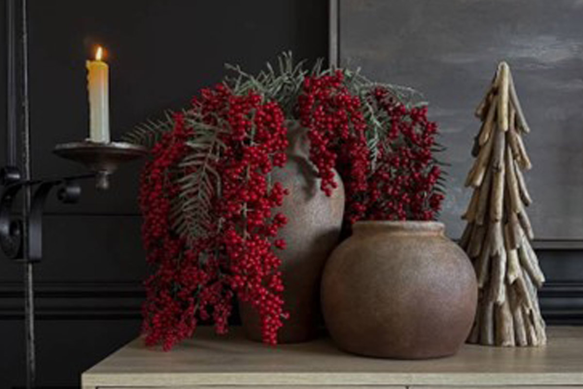
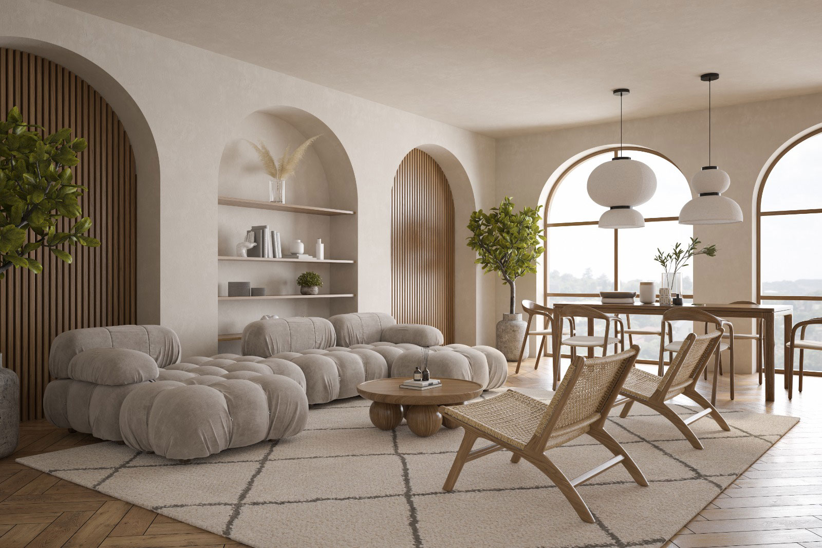
Homes that look as if they came straight out of the same catalog. Beige talking to beige, taupe embracing off-white. A polite ballet of neutral tones that offends no one — but excites no one either.
This epidemic of neutrality is born out of fear: fear of getting it wrong, fear of resale value, fear of hearing “won’t that color get tiring?”
The truth? Monochromatic homes are stunning in photographs — impossible to live in with personality.
Color isn’t decoration. It’s emotion, character, and self-expression.
The cure? A ticket to the museum
Color education begins with art.
Standing before an Annunciation by Simone Martini, you understand what it means to dare: red, green, and blue coexisting “like two fields divided by a border ditch.” Melodious colors following no conventional rule.
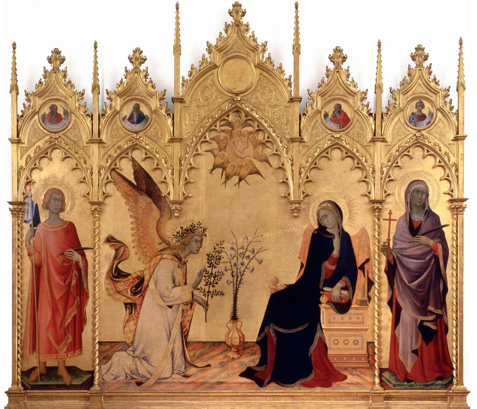
Simone Martini – Annunciazione – 1333 – photo from www.uffizi.it
Or take Paolo Uccello’s Battle of San Romano: orange horses against blue fields — “unnatural and vivid colors” that create a fairytale world where color becomes pure poetry.
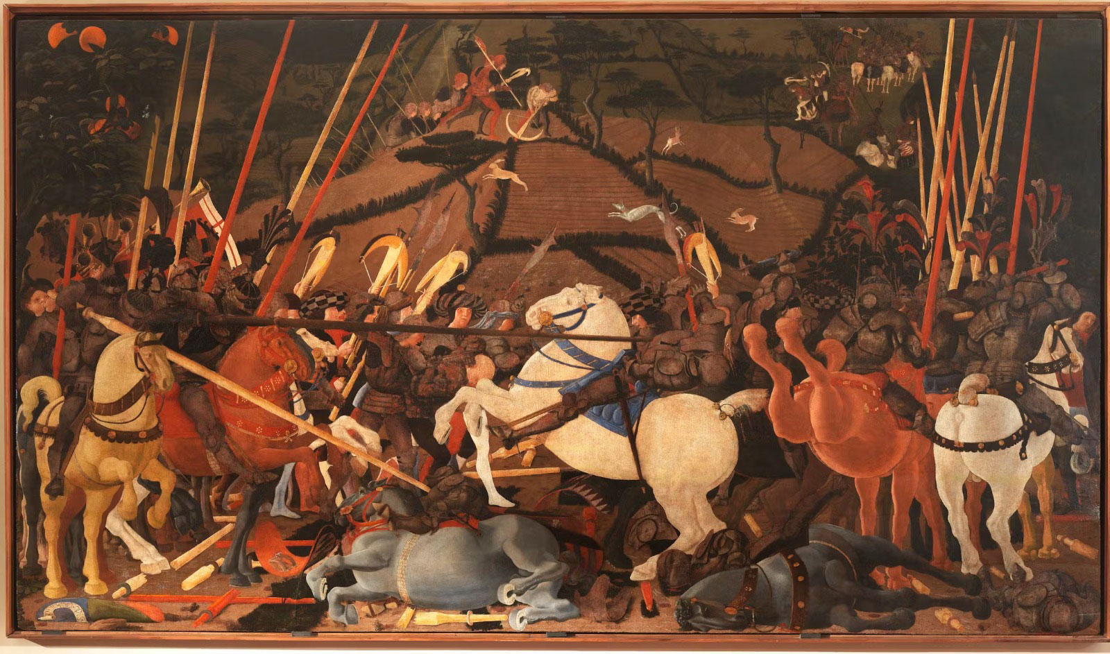
Paolo Uccello – Battaglia di San Romano – 1438 circa – photo from www.uffizi.it
Masters of color: five lessons to bring home
El Greco: The Courage of “Uncomfortable” Colors
Domínikos Theotokópoulos had a principle: “Color is the most important element of a painting.”
His figures wore what contemporaries called “almost disturbing” shades — acid green, blood red, intense yellow, deep violet. Francisco Pacheco wrote that El Greco loved “large patches of pure, unmixed color.” He didn’t dilute. He didn’t mediate. He asserted.
In your home: That olive-gray sofa? Add vermilion cushions and an acid-green vase. El Greco did it in 1577.
Tintoretto: The Art of Dramatic Contrast
Jacopo Robusti built his masterpieces from dark backgrounds to reach light, with a “vibrant chromaticism” made of “violent contrasts.”
In your home: A navy blue or anthracite wall becomes a theatrical backdrop that makes colors explode.
That yellow vase that disappears against white? Against a dark wall, it becomes the star.
Bronzino: Elegance Does Not Mean Neutrality
Agnolo Bronzino painted with “icy precision” yet never renounced “vivid colors.” The lesson: refinement can coexist with intensity.
In your home: Fuchsia or turquoise are not vulgar. Bronzino proves that elegance is about calibration, not attenuation.
Veronese: When Many Colors Create Harmony
Paolo Veronese mastered “brilliant palettes” with ease. His Wedding at Cana is a polychromatic explosion — perfectly harmonious.
In your home: Every chair can be a different color. That’s not chaos — it’s orchestrated composition.
Titian: Color Is the Subject
For Titian, color wasn’t an attribute — it was the very essence of painting.
In your home: Don’t ask, “What color should I add to the beige?” Ask, “What story do I want to tell through color?”
Color is the protagonist, not the accessory.
From art to home: practical rules
- Dare the “impossible” — If Simone Martini paired red, green, and blue, you can try mustard yellow with petrol blue.
- Use contrast — Like Tintoretto, alternate dark areas with bursts of color. An anthracite bookcase enhances colorful spines.
- Choose pure colors — El Greco never diluted. Pick the red that moves you, not its “safe” faded version.
- Balance your palette — Like Veronese, orchestrate. Three well-balanced colors beat ten random ones.
- Photograph what moves you — Every museum is a classroom. That combination you spotted in a Pollaiolo? Capture it, then replicate it at home with throws, cushions, or vases.
Travel as education and the courage to choose
Color insecurity fades when you begin to travel through museums.
When you see medieval frescoes where blue and gold coexist fearlessly.
When you discover that in Medici salons, bottle green embraced dusty rose.
The masters already experimented for us — leaving behind a legacy of combinations to borrow and reinterpret.
Introducing color into your home is an act of courage. It’s saying “this is who I am” instead of hiding behind beige.
It’s choosing authenticity over safety.
The Renaissance masters never feared color — they knew it was life, energy, emotion.
Your home, too, can dare those combinations that make your heart beat faster.
It can be the place where vermilion red meets emerald green — and magic happens.
The greatest mistake isn’t choosing the wrong color.
It’s not choosing at all.
Next time you enter a museum, stop in front of a Pollaiolo, a Tintoretto, an El Greco.
Watch how colors dance without fear. Then go home — and bring that courage with you.
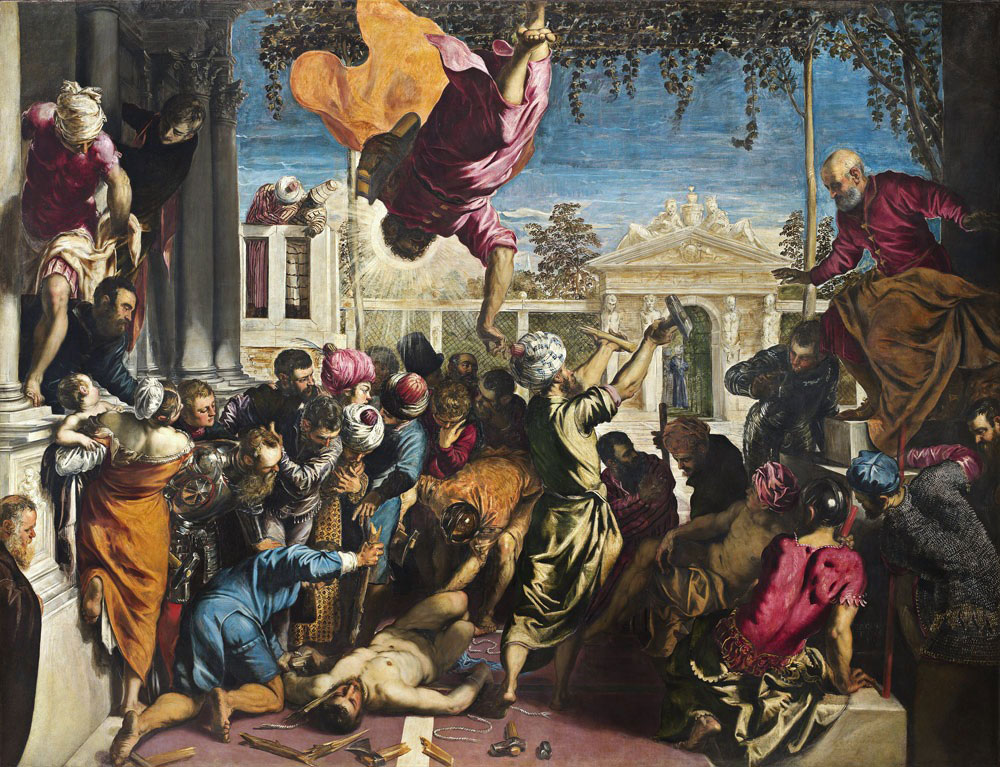
Jacopo Tintoretto – Venezia, 1519 – 1594 – photo from www.gallerieaccademia.it